Concept Design:
Otherside Matcha House
As a huge matcha lover, this project was an absolute passion piece.
I really enjoyed building a concept for “The Mindful Vancouverite”—someone who values high-quality, authentic matcha rather than the latest trend. Since this audience knows exactly what they want and appreciates straightforward excellence, I designed Otherside Matcha House to be their reliable, go-to hot spot.
Brand Strategy and Discovery
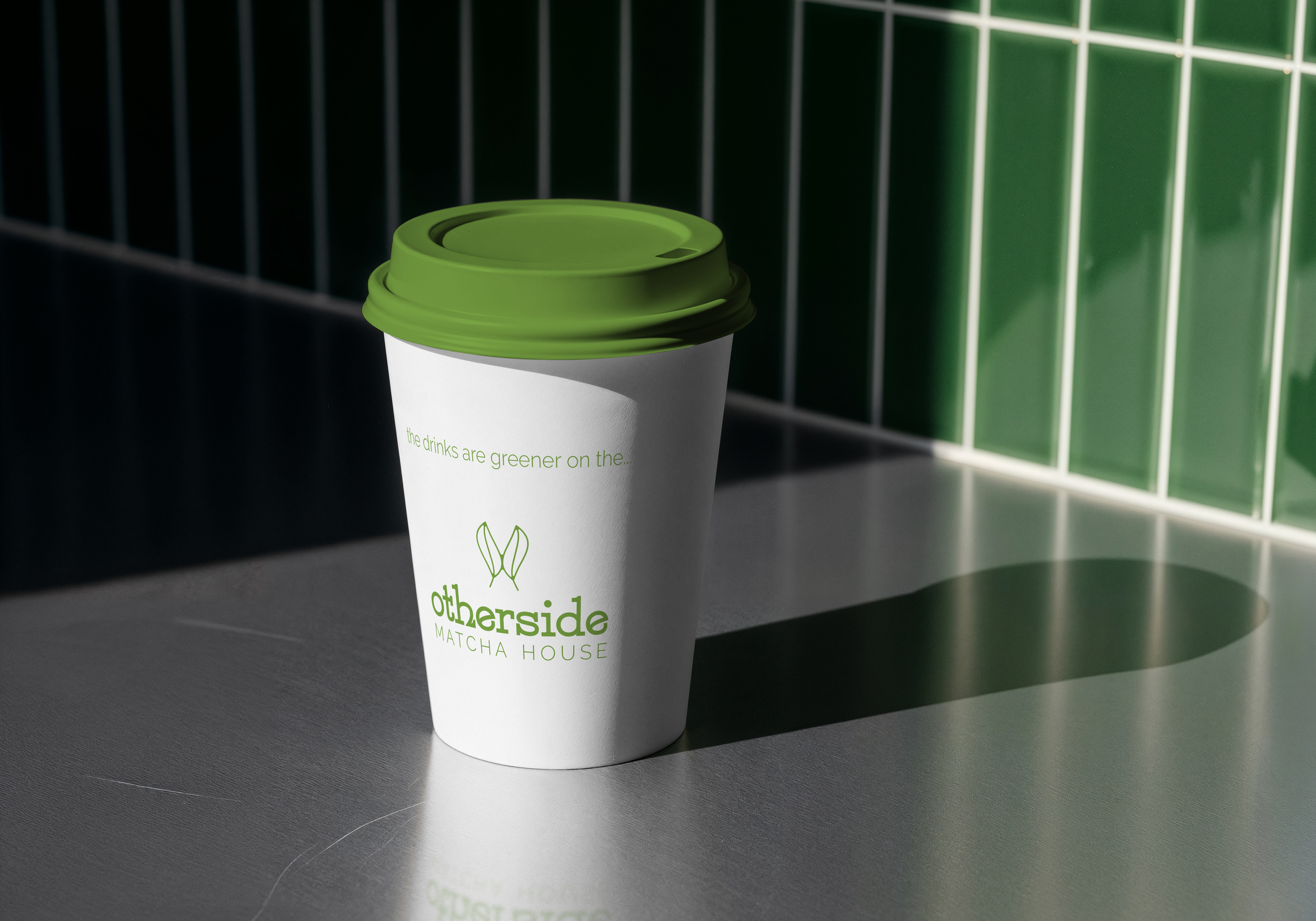
Narrative: Why “Otherside”?
“Otherside” refers to the idiom,
“The grass is greener on the other side,” while relating the green matcha tea leaves to a vibrant grassy green.
Mission: Why are we different?
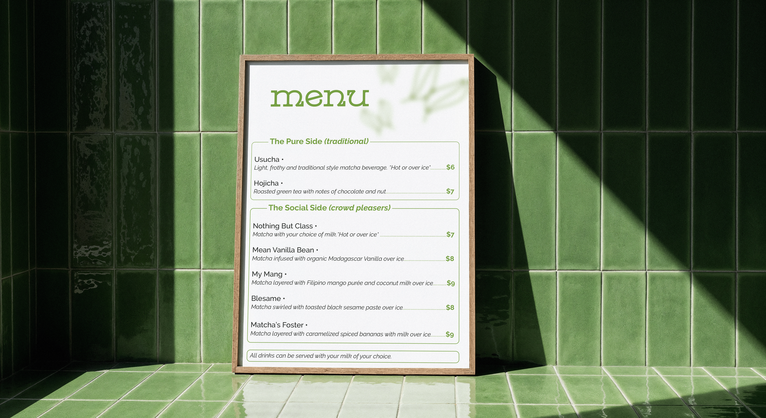
Otherside Matcha House only uses high-grade ceremonial matcha powders originating from Uji (Kyoto), Japan.
We offer a full-scale matcha experience from traditional Usucha and Hojicha beverages, to crowd-pleaser creations.
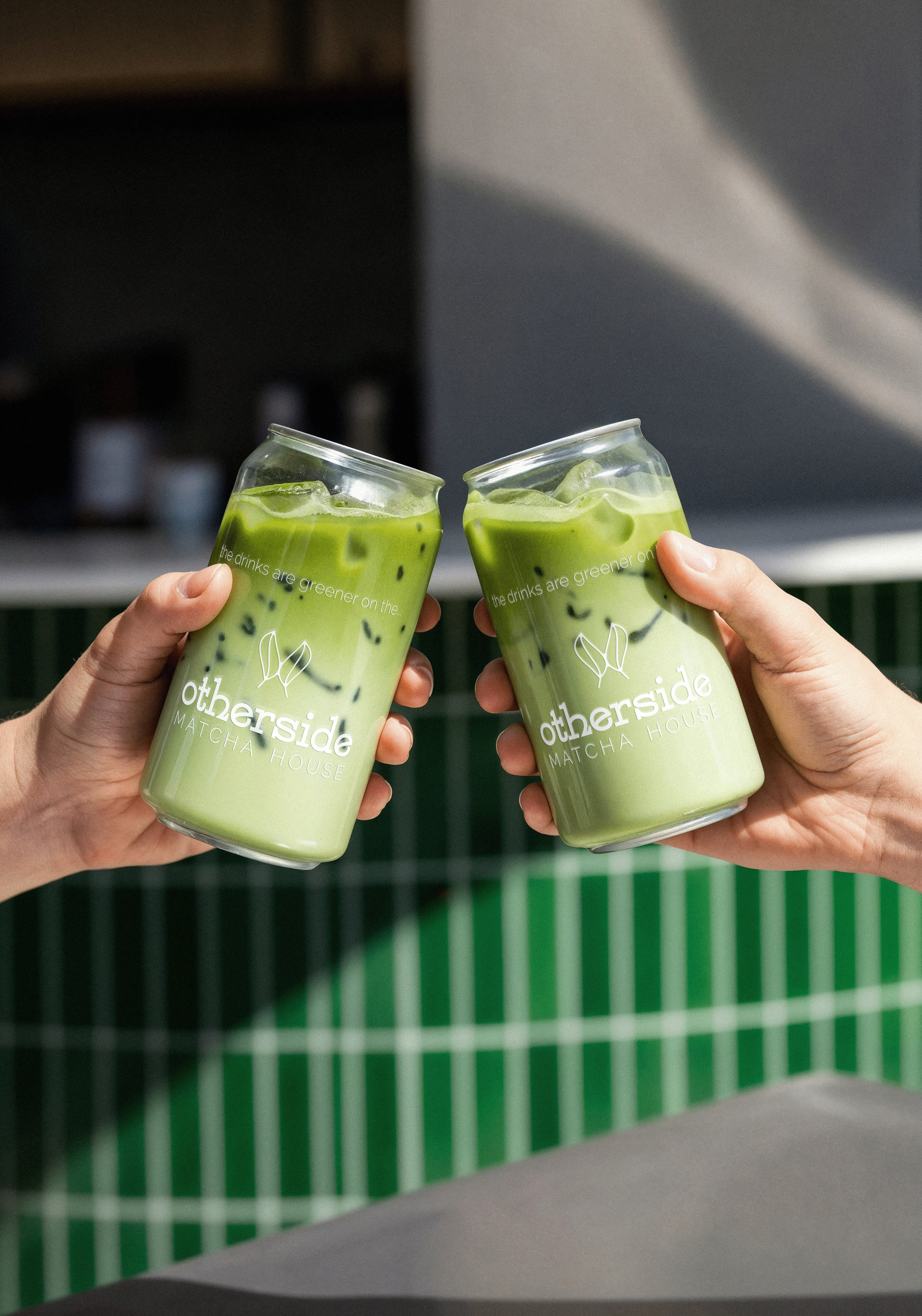
Each cup is decorated with our slogan to emphasize our commitment to quality and rarity of our supplied matcha powder in British Columbia.
Target Audience: Persona
Our target audience is "The Mindful Vancouverite”. This is someone who seeks great matcha and an energy surge without the jitters. Many people in this city have made the switch from coffee to matcha, so we would like to provide a reliable option for those
on-the-go.